
A brand book that couldn't print itself
Read case study
Challenge
After fifty years of evolving from a vocational training centre into Canada's first northern university, Yukon University landed on a brand new identity in 2020. The brand guidelines arrived from an external agency, the launch calendar was already set, and then came the catch: no internal capacity to actually produce the collateral. A gorgeous brand book doesn't print itself.
Solution
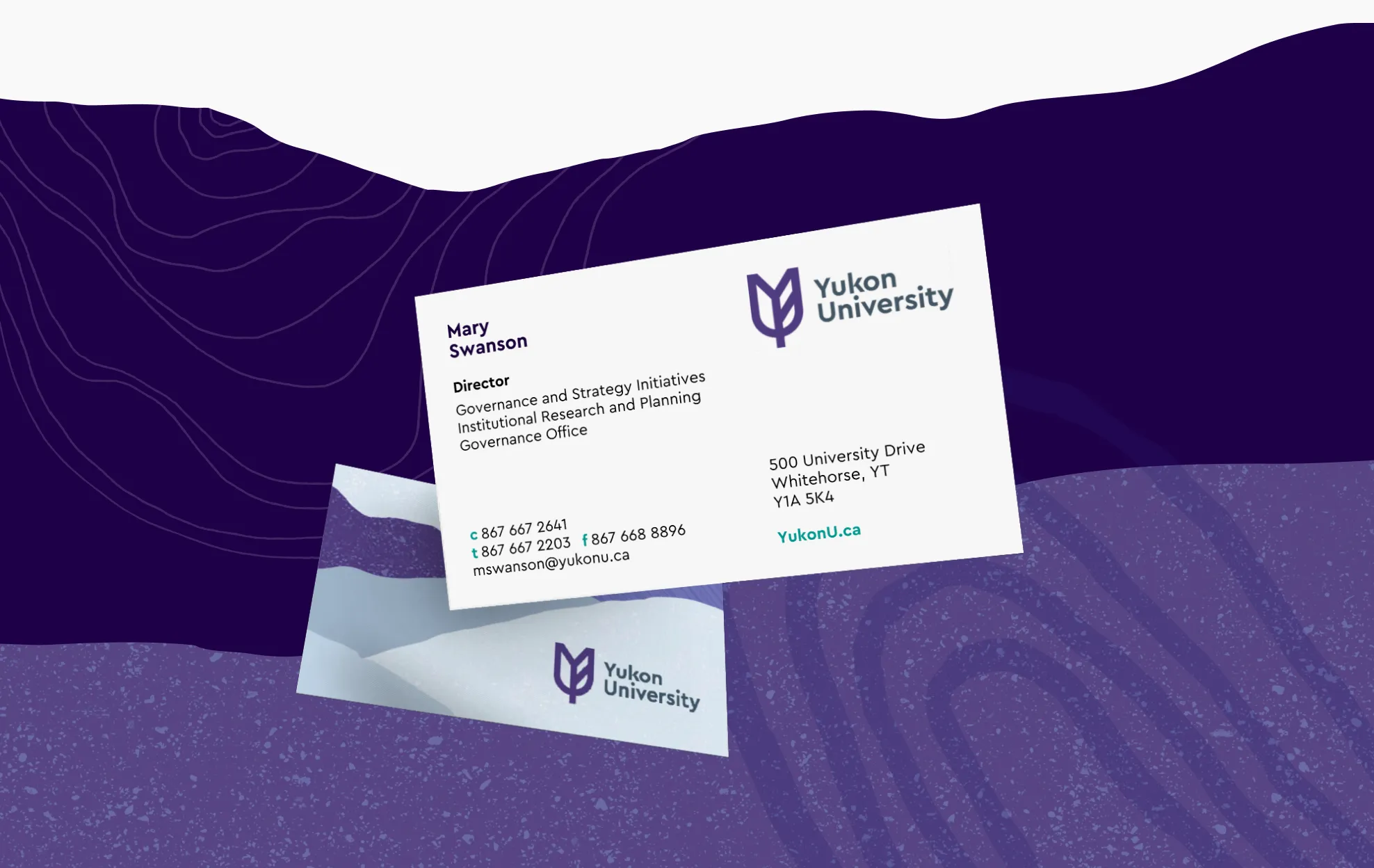
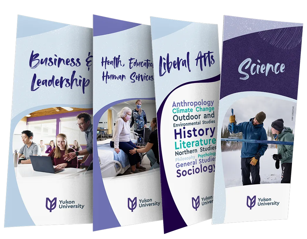
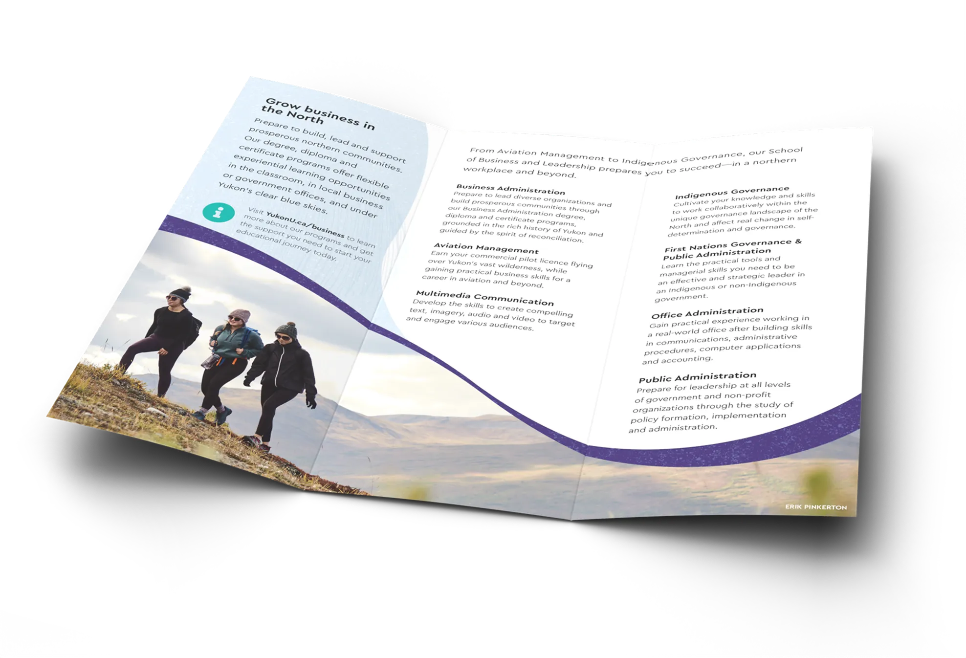
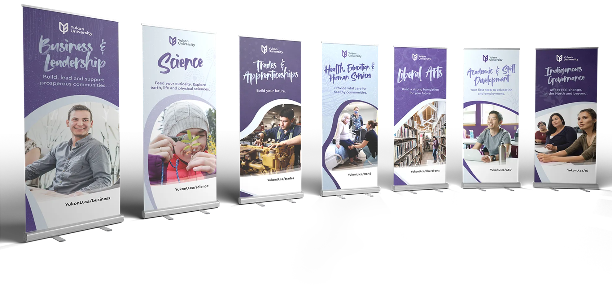
I stepped in as the production team, translating the new logo, colour palette and brand elements into materials people could actually use. That meant business card templates for 300+ staff across 14 campuses, ten brochures ranging from a simple trifold to a double parallel reverse fold with tabs, plus letterhead, envelopes and popup banners. Every piece consistent, on brand, and out the door on schedule.
Results
Everything landed on schedule, across fourteen campuses, and it all looks like it came from the same place, which is the only test a rollout this wide has to pass. A brand becomes real at the moment somebody hands over a business card. Yukon U got to that moment on its launch date instead of six months after it.
Credits
- Design and production
- Mikayla Ericsson
- Account management
- Bianca Jorgenson
- Studio
- MBDC