
A school board brand the students helped draw
Read case study
Challenge
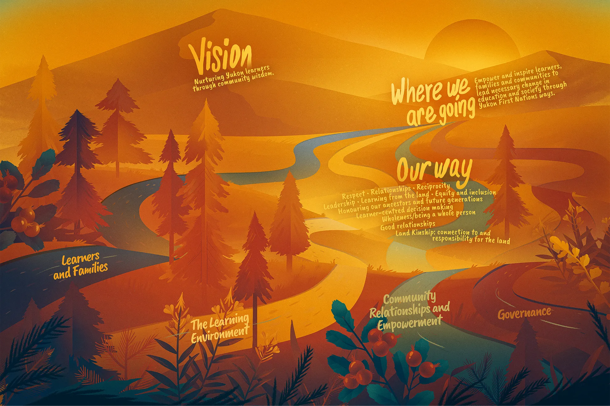
The First Nation School Board is a new education authority in the Yukon, responsible for 11 public schools and for building an education system rooted in Yukon First Nations worldviews. It needed a brand that could carry all of that: land-based learning, community wisdom, real support for every student, empowered families, and schools that work as genuine community hubs. The identity also had to hold First Nation principles of respect, relationships, reciprocity, leadership, and land kinship, without flattening them into decoration.
Solution
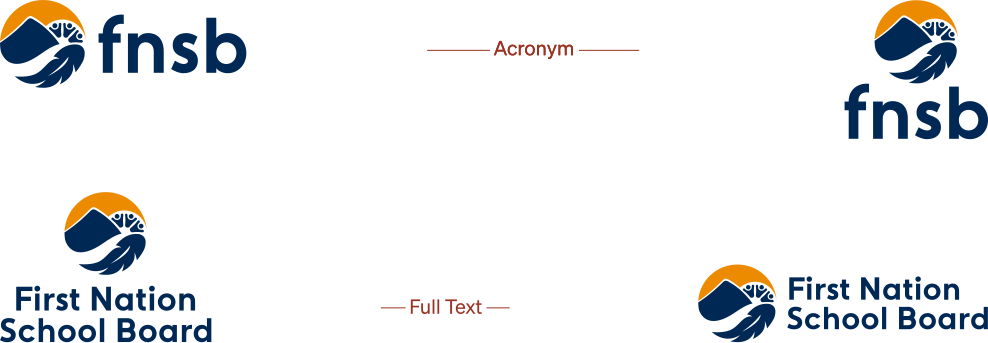
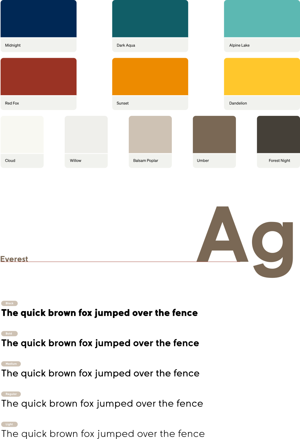
I started by listening. In the spring of 2023, I ran workshops with Yukon students across a range of grade levels and invited them into the branding process directly, so their ideas and artwork shaped the logo itself. The finished system runs from bold, modern logo variations through a colour palette and type system to illustrative elements drawn from northern landscapes. It works everywhere FNSB needs it to, and every piece of it traces back to the people it was built for.
Results
The board now has one identity for eleven schools, and it can go on a sign, a jersey or a letter without a style debate every time. The better result is quieter. The students who sat in those workshops can find their own work in the logo, and a new education authority starting from a standing start needs a community's trust more than it needs a campaign. A brand the kids drew is the shorter route to it.
Credits
- Creative direction, community engagement, brand identity and design
- Mikayla Ericsson
- Account management
- Bianca Jorgenson
- Studio
- MBDC