

Rebuilt around what people actually came for
Read case study
Challenge
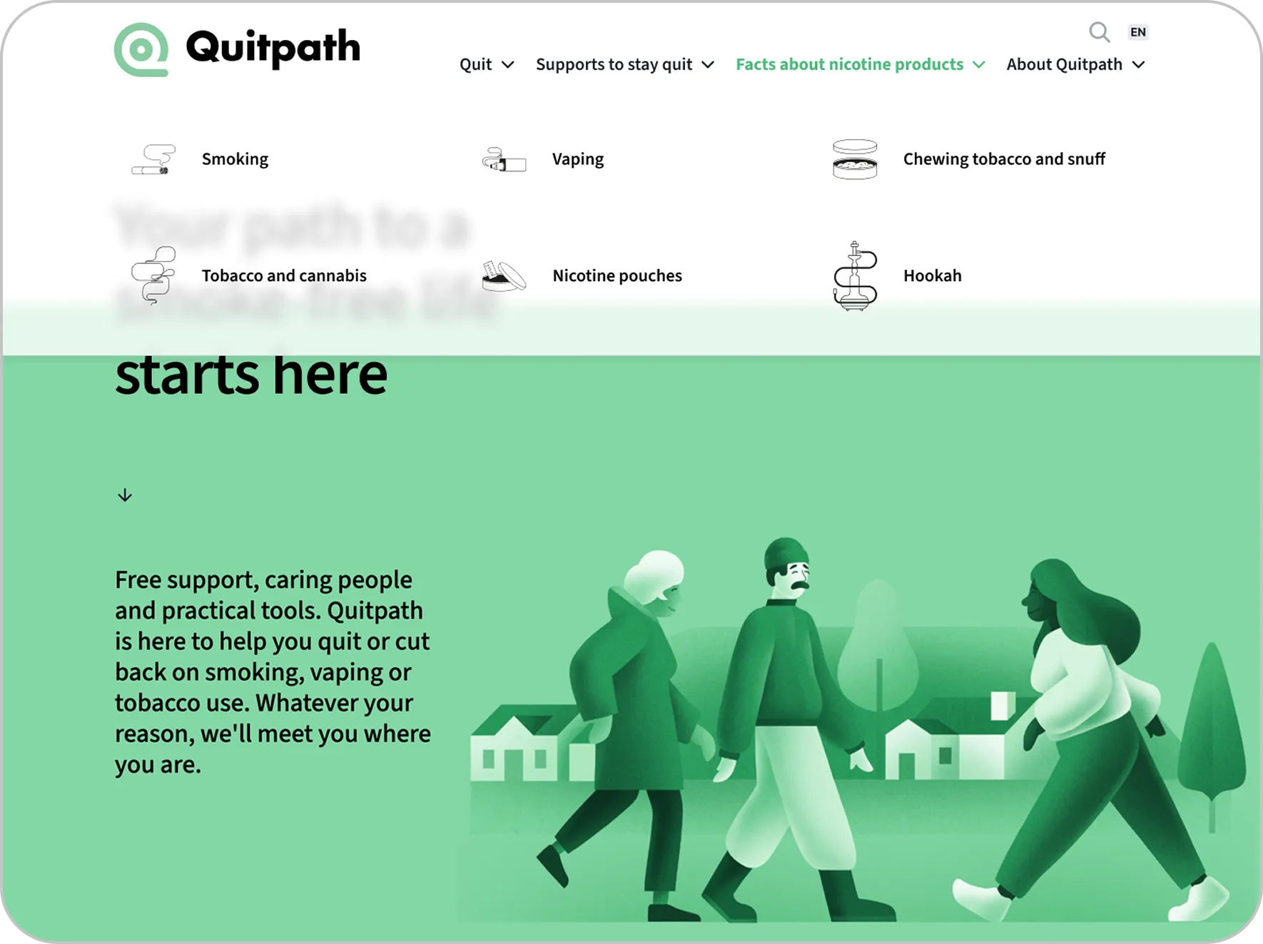
Quitpath’s previous website was hampered by disorganized content and a confusing structure. Users struggled to find relevant help because information was scattered across too many pages with unclear navigation. The site contained redundant, outdated, and low-value content, while important tools like progress tracking and cost calculators were absent or poorly integrated. Research showed that users prioritized access to quit coaches and medications, but the website did not effectively guide them to these essential services.
Solution
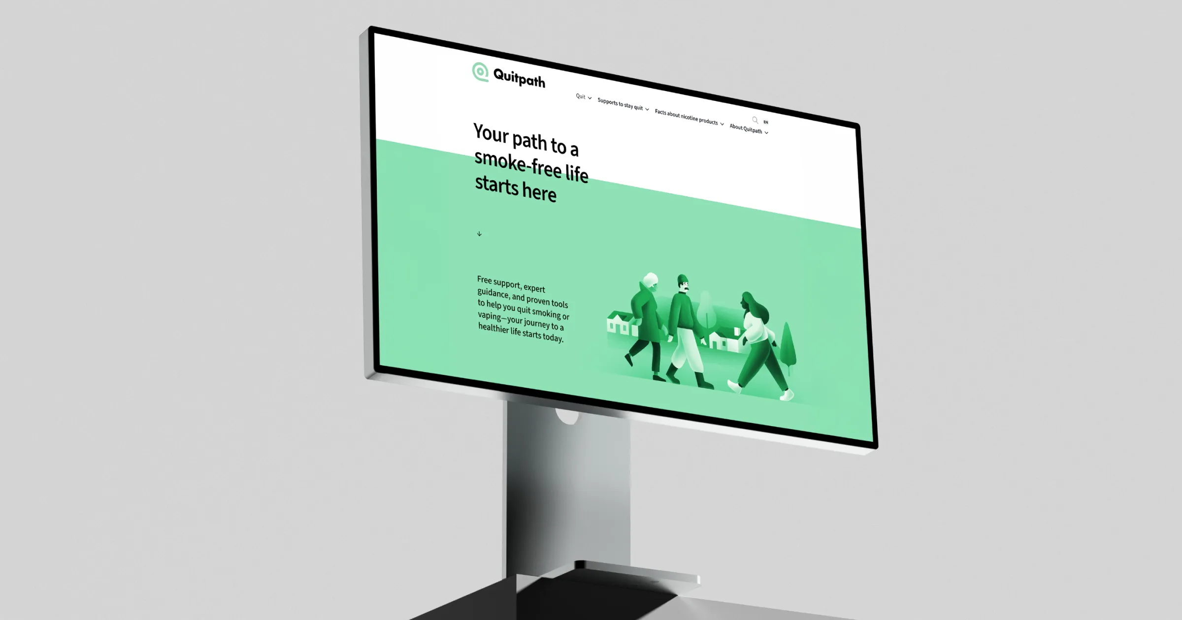
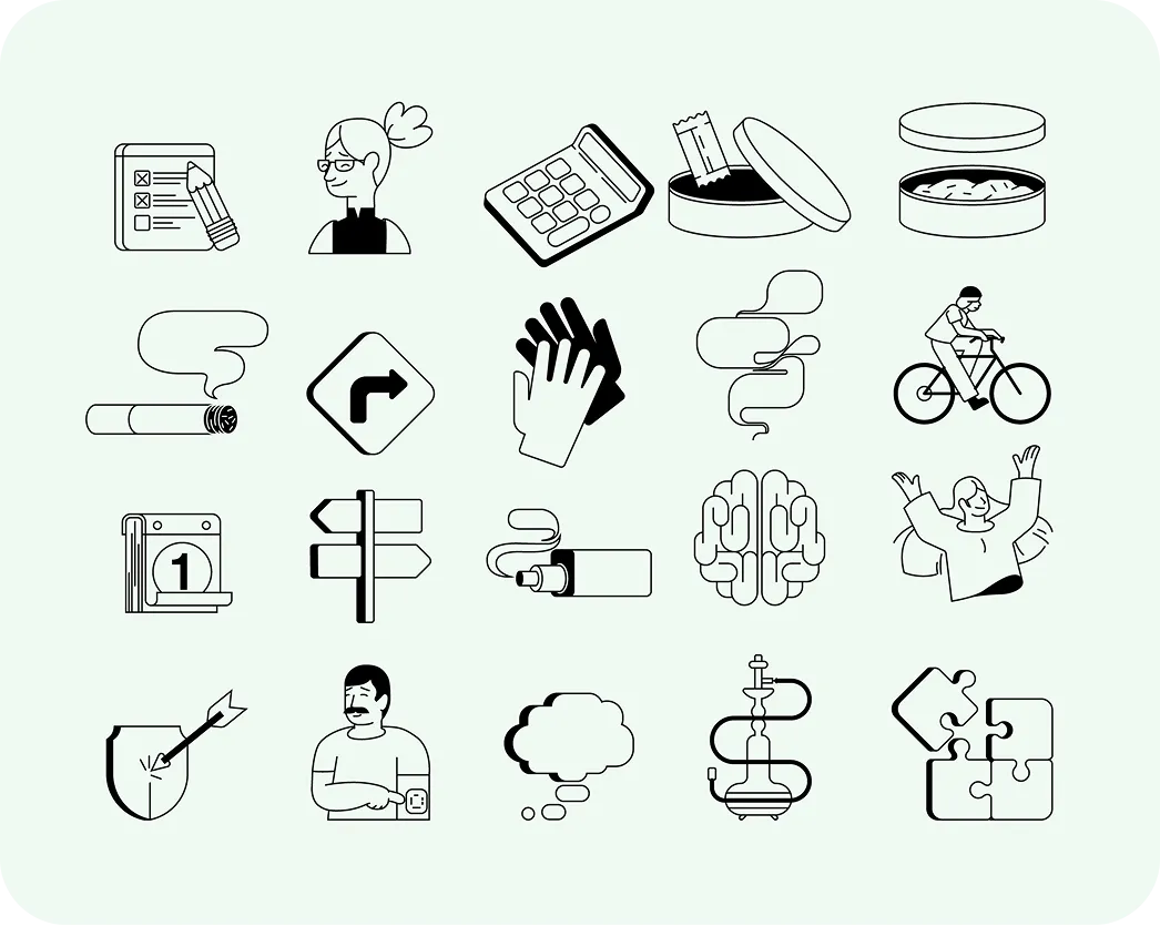
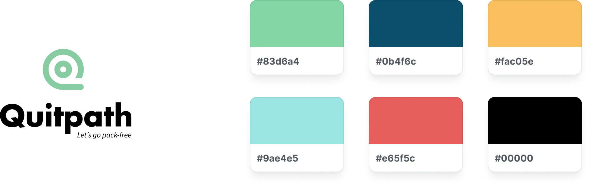
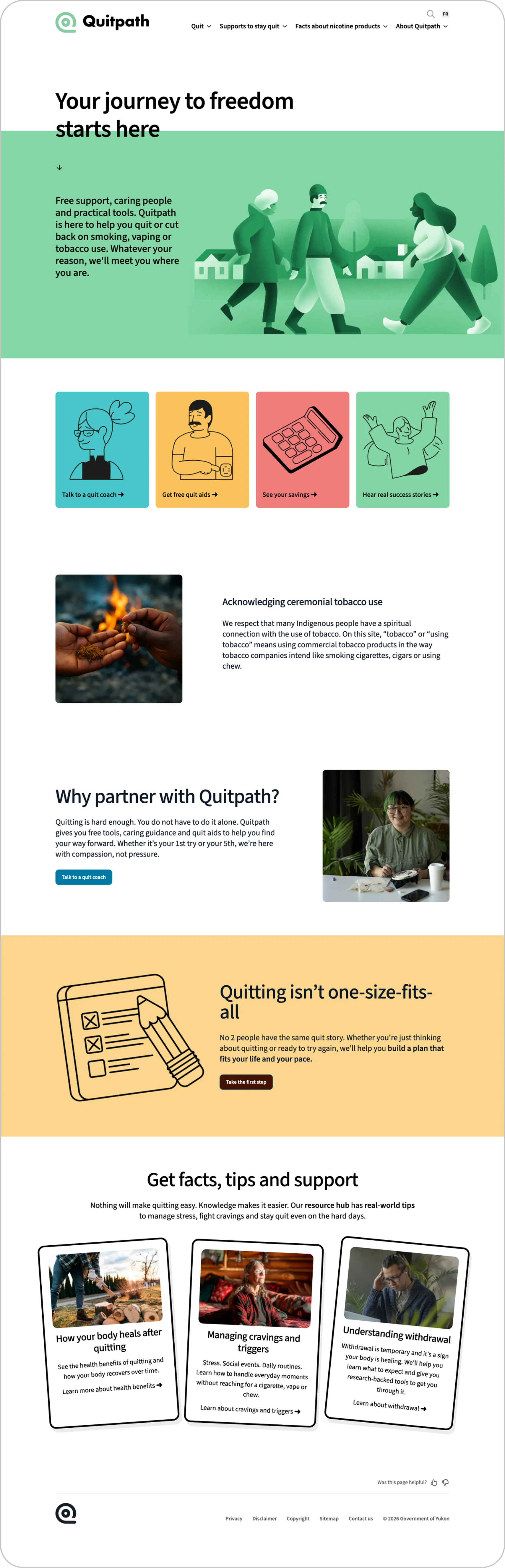
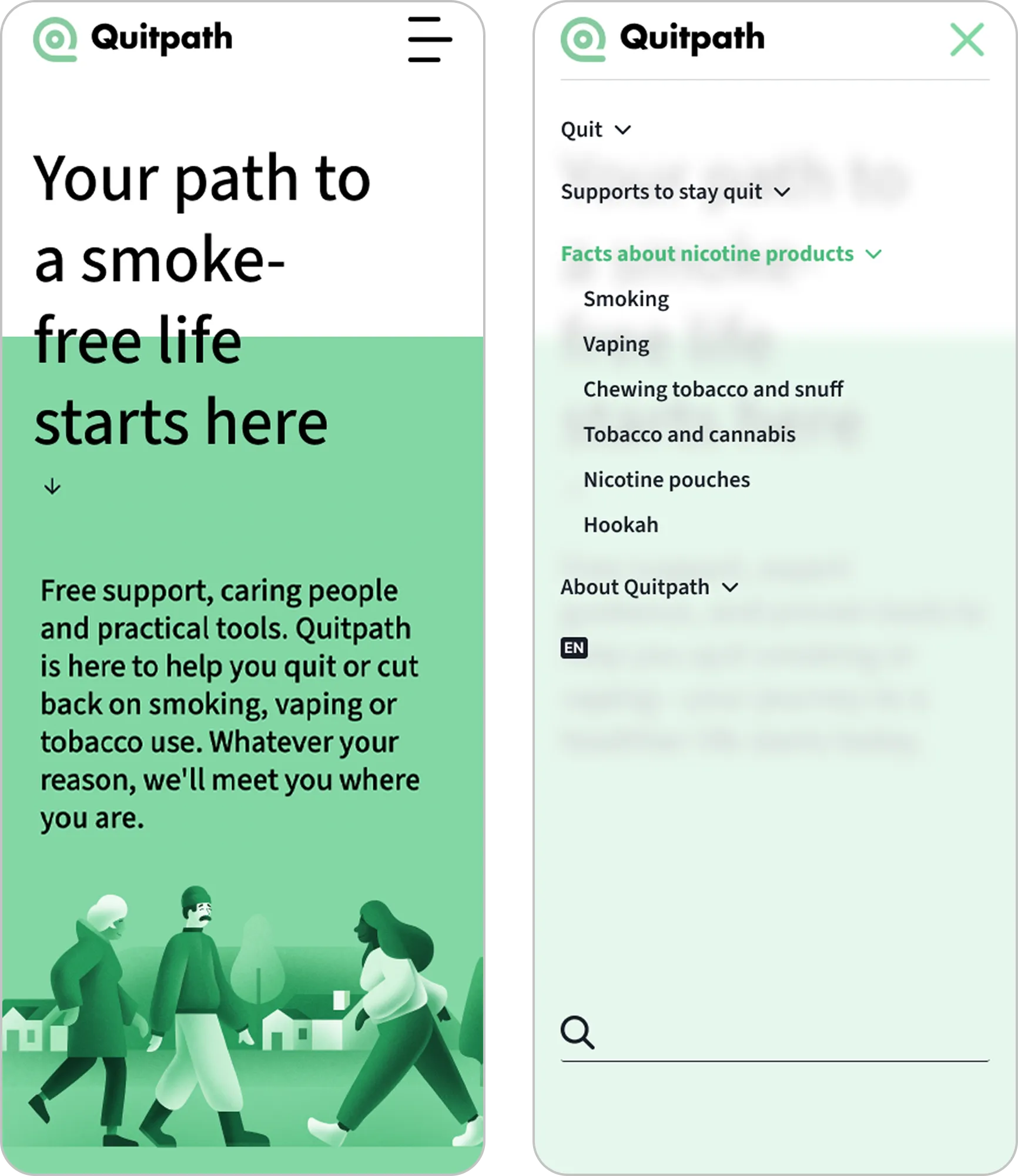
I led the redesign, starting with client interviews and a look at how the better cessation apps handle the same job. The research said something simple: people arrive wanting a quit coach and medication, not a library. So I reorganized the site around those goals, cut the redundant and outdated pages, and set a clear hierarchy against the government's accessibility standards. Progress tracking and the cost calculator went from missing to central. The design system is WCAG 2.0 compliant, with card layouts, Yukon illustration and a custom icon set that make a hard subject feel handled rather than clinical.
Results
Someone deciding to quit is not in a browsing mood. The site gets them to a coach or to medication support within a couple of clicks of the front door now, and the tools that help on day forty sit on the same map as the ones that help on day one. It's also a structure the team can extend, which matters for a resource that has to keep pace with whatever people pick up next.
Credits
- Research, information architecture and design
- Mikayla Ericsson
- Account management
- Bianca Jorgenson
- Illustration
- Charles-Étienne Brochu
- Studio
- MBDC