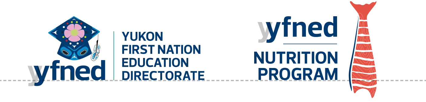
A standalone mark that still reads as YFNED
Read case study
Challenge
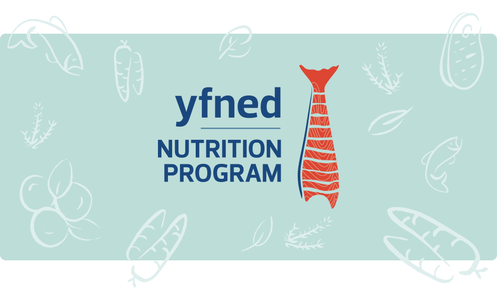
YFNED exists to put First Nation decision-making at the centre of education in Yukon. Its Nutrition Program is one of the most visible pieces of that work, funded through Jordan's Principle to get equitable, healthy food to Indigenous children: in-school meals, food hampers and family feasts. The program needed a mark of its own, one a kindergartener would spot on a lunch bag and a high school student wouldn't roll their eyes at. It also had to read as YFNED's without borrowing the parent logo to prove it. A standalone brand that still belongs to the family, in other words, and those two things usually pull in opposite directions.
Solution
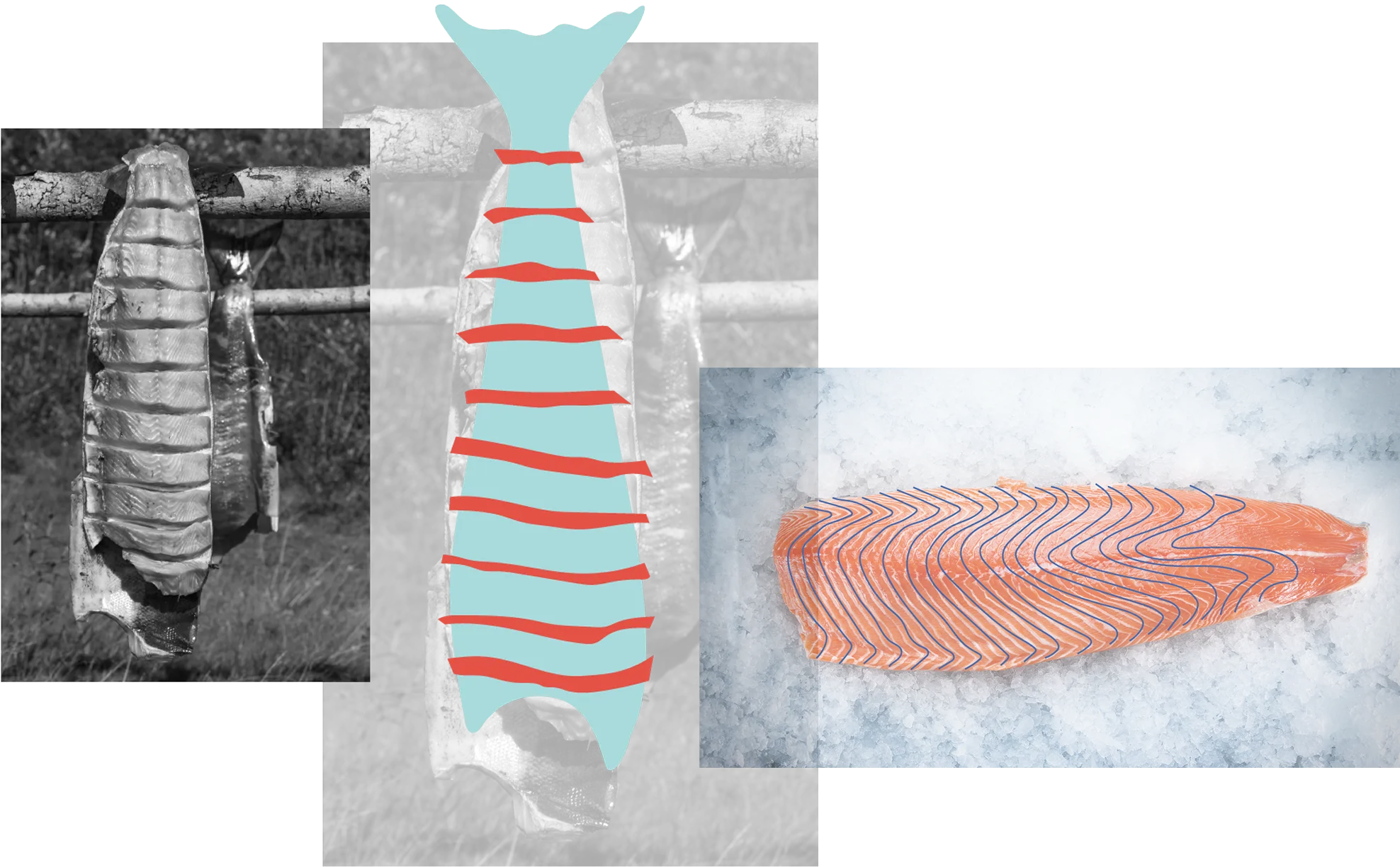
I built the mark around dried salmon. It works on every level at once. Food, obviously, but also wealth, trade and a way of life that has fed people here far longer than any of the institutions involved. It frames the program as provision rather than charity, which is closer to the truth of what it is. The palette takes its cues from YFNED's primary colours and from the places the food comes from, drawing on berries, water and the night sky, so the two logos sit together comfortably without either one imitating the other. From there I took the mark everywhere the program actually shows up: a brochure, pop-up banners for feasts and school events, window decals, letterhead, posters and promotional merchandise kids would keep.
Results
The Nutrition Program has a face of its own now, and it earns recognition before anyone reads a word. Staff can set up a banner at a family feast, stick a decal in a school window or hand out a hamper, and the connection back to YFNED lands on its own, without a line of explanation or a second logo doing the work. One identity, holding up at both ranges: close enough to read on a lunch bag, and clear across a gym full of families.
Credits
- Brand identity, design and production
- Mikayla Ericsson
- Account management
- Bianca Jorgenson
- Studio
- MBDC