An identity built to feel human first
Read case study
Challenge
In January 2021, the Yukon Government established a fully funded, accessible midwifery service to provide pregnancy, labour, and post-birth care for families in the Yukon. With this new publicly funded care team in place, the government faced the challenge of developing a distinct brand identity that would effectively represent the program and resonate with the families seeking midwifery services.
Solution
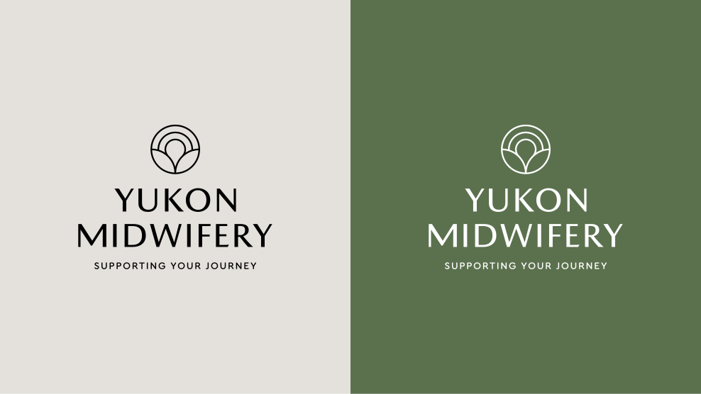
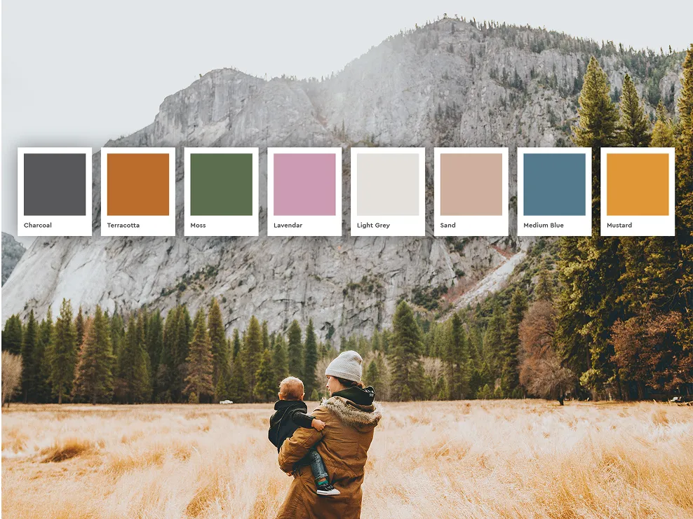
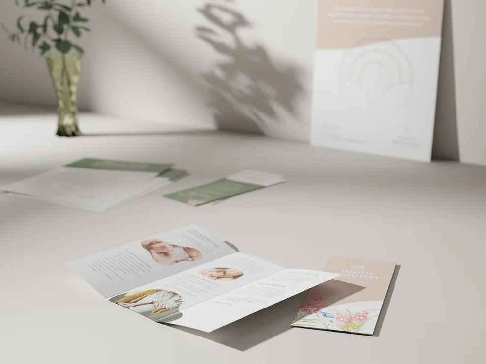
The program was brand new, fully funded and free, which gave the identity a second job. It had to make a service nobody had heard of feel like it had always been there. So I built a nature-inspired logo that reads toward birth and holistic care rather than administration, and a calm, broad palette grounded in earth tones that works for an expecting parent, a partner and a practitioner without pandering to any of them.
Results
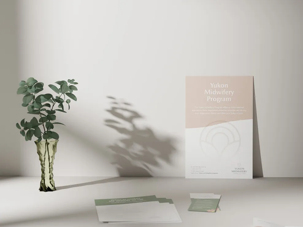
Families meeting the program for the first time meet a mark that looks like the care on offer rather than the department offering it. And because the palette and logo were built broad rather than precious, the program has been putting them on posters, brochures and clinic walls ever since without coming back for a new asset each time.
Credits
- Brand identity, design and production
- Mikayla Ericsson
- Account management
- Bianca Jorgenson
- Studio
- MBDC