


Naming, brand and a resource hub built from scratch
Read case study
Challenge
Access to essential services in Yukon and Northern BC has historically been fragmented, with crucial information scattered across various organizations and platforms. IWIC sought to create a centralized, culturally respectful digital space capable of supporting a diverse array of needs, including crisis response, housing, cultural revitalization, and 2SLGBTQIA+ advocacy. IWIC wanted one place that could hold all of it: crisis response, housing, cultural revitalization and 2SLGBTQIA+ advocacy, in a space that reflects Indigenous worldviews rather than translating them. It also had to work for an Elder and a teenager on the same afternoon.
Solution
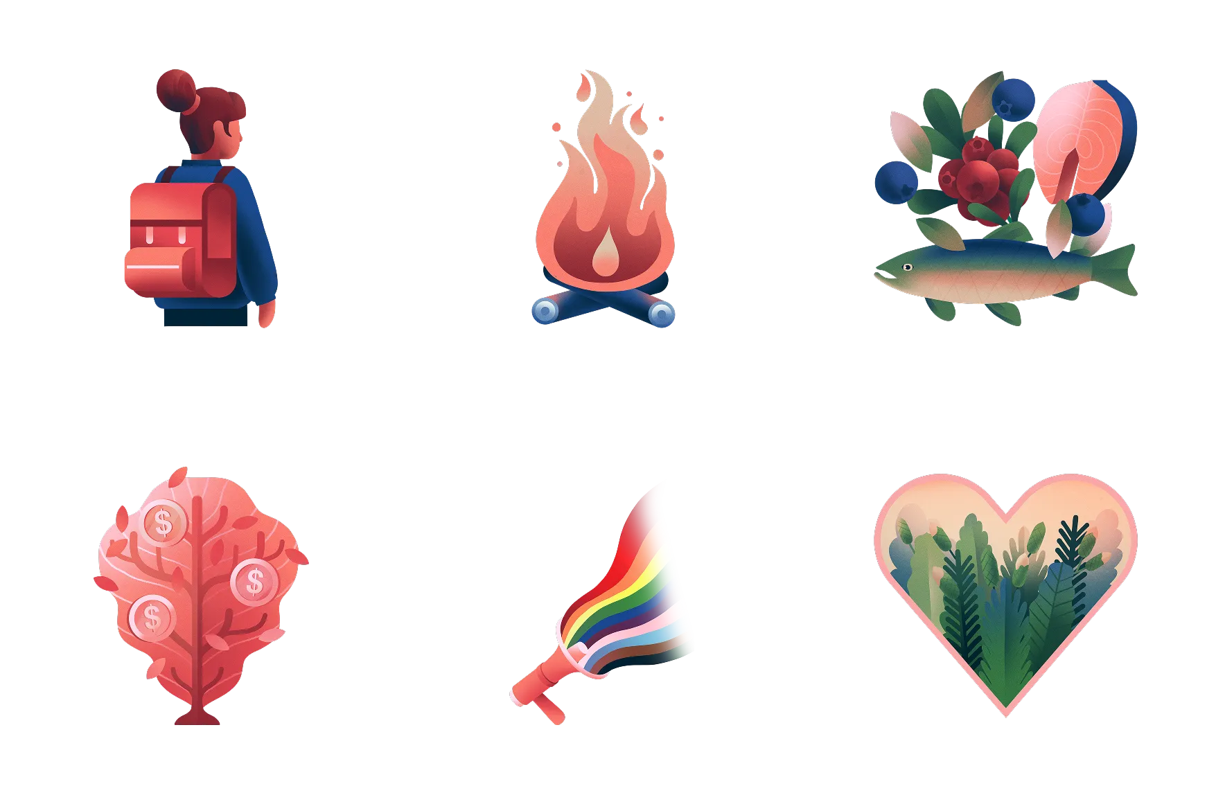
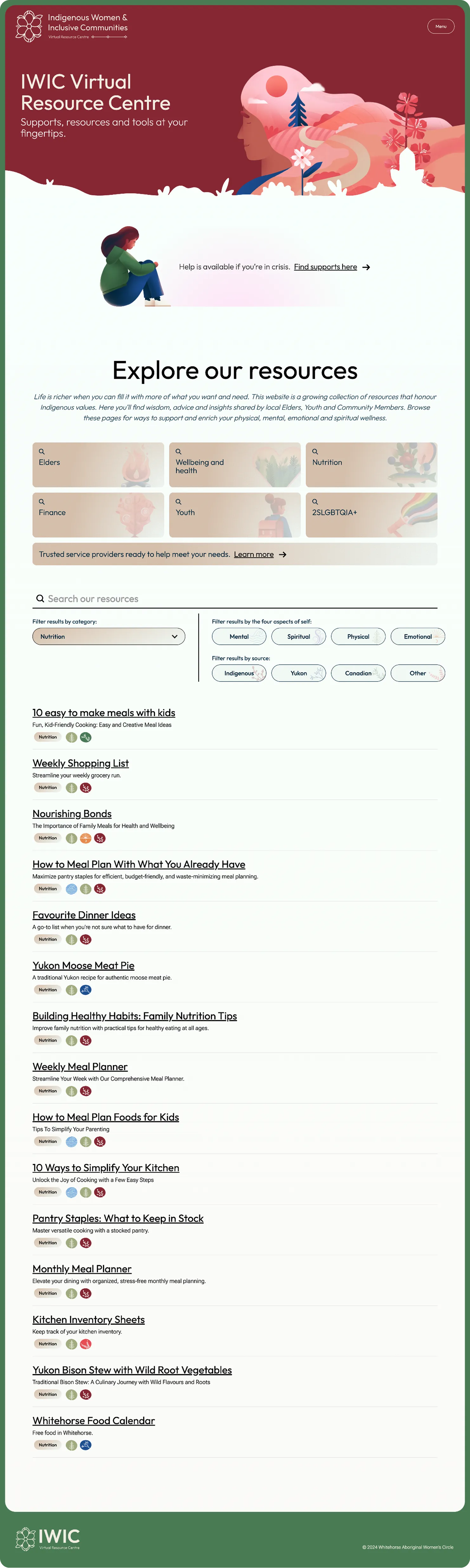
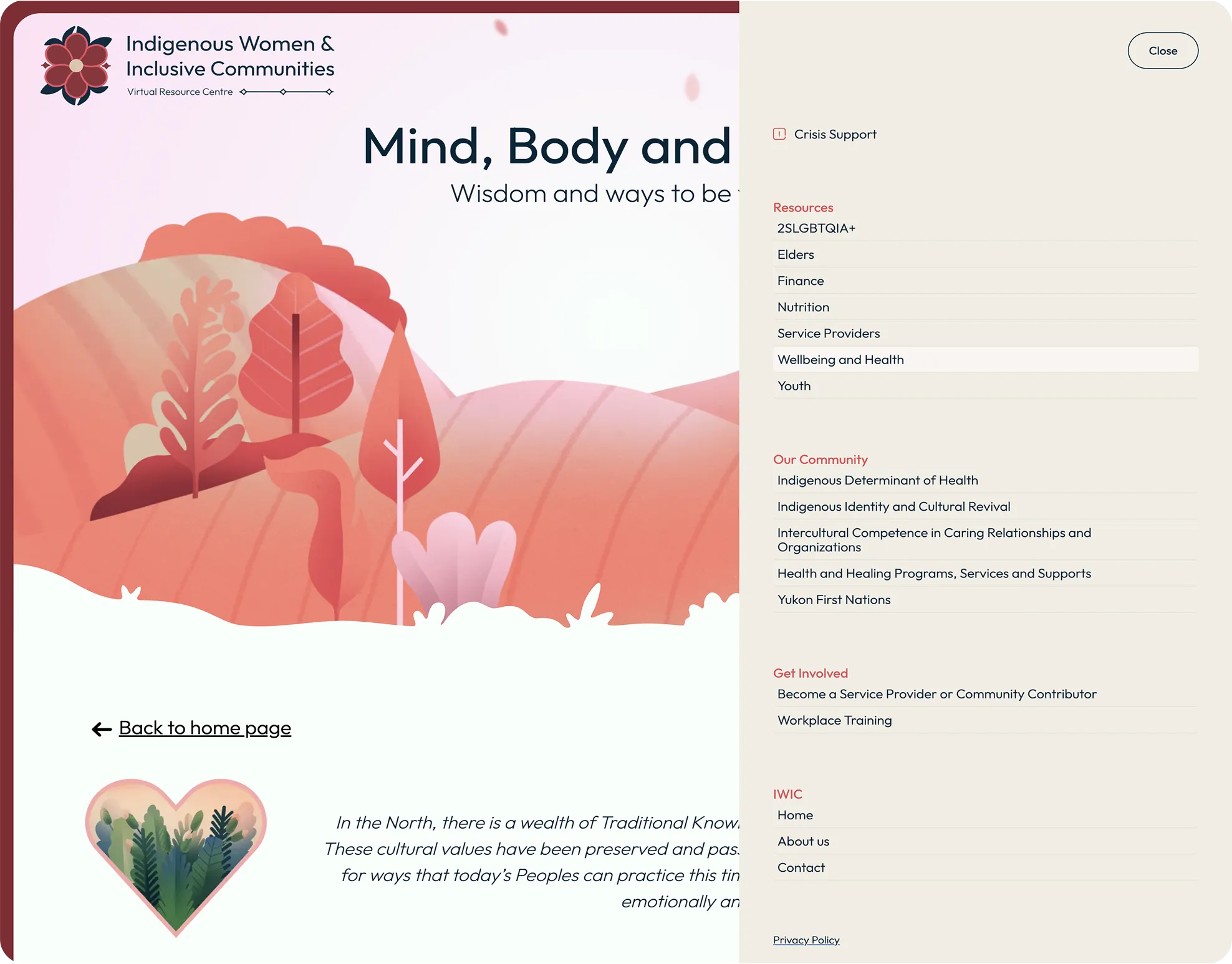
I directed the project from the naming through to launch, and built the site itself. The name, the identity and the brand guide came first, so the resource centre had somewhere to live instead of a brand bolted on afterward. Resources are sorted into the categories people actually arrive looking for, including cultural revival, health and wellbeing, youth, Elders, crisis support and 2SLGBTQIA+, and a service provider directory connects to more than 40 local organizations. The content sits traditional teachings and land-based learning alongside contemporary supports rather than in a section of their own, because for most of the people using it they were never separate.
Results
Forty-odd organizations that used to be forty-odd separate searches now sit behind one door, and the people who need them most are usually the least able to spend an afternoon looking. The categories are named the way someone describes their own situation, not the way the sector files it, which is most of the difference between a directory and a resource.
Credits
- Creative direction and development
- Mikayla Ericsson
- Account management
- Bianca Jorgenson
- UI/UX and brand identity
- Meghan Reid
- Copy
- Joe Fitzgerald
- Illustration
- Charles-Étienne Brochu
- Studio
- MBDC